1000x this! I’ll expand on this to give more history about why I started this and what will be different.
Background
There have been several long standing issues with the original logo that I want to fix. There are also general issues with our branding that I want to resolve.
- If you look closely, you’ll see that the edges of the lambda are not collinear (see image below).
- Additionally, you’ll see that edges of the lambdas that should be horizontal are not (see image below).
- The gradients of the lambdas are not well defined and are not the same for both colors.
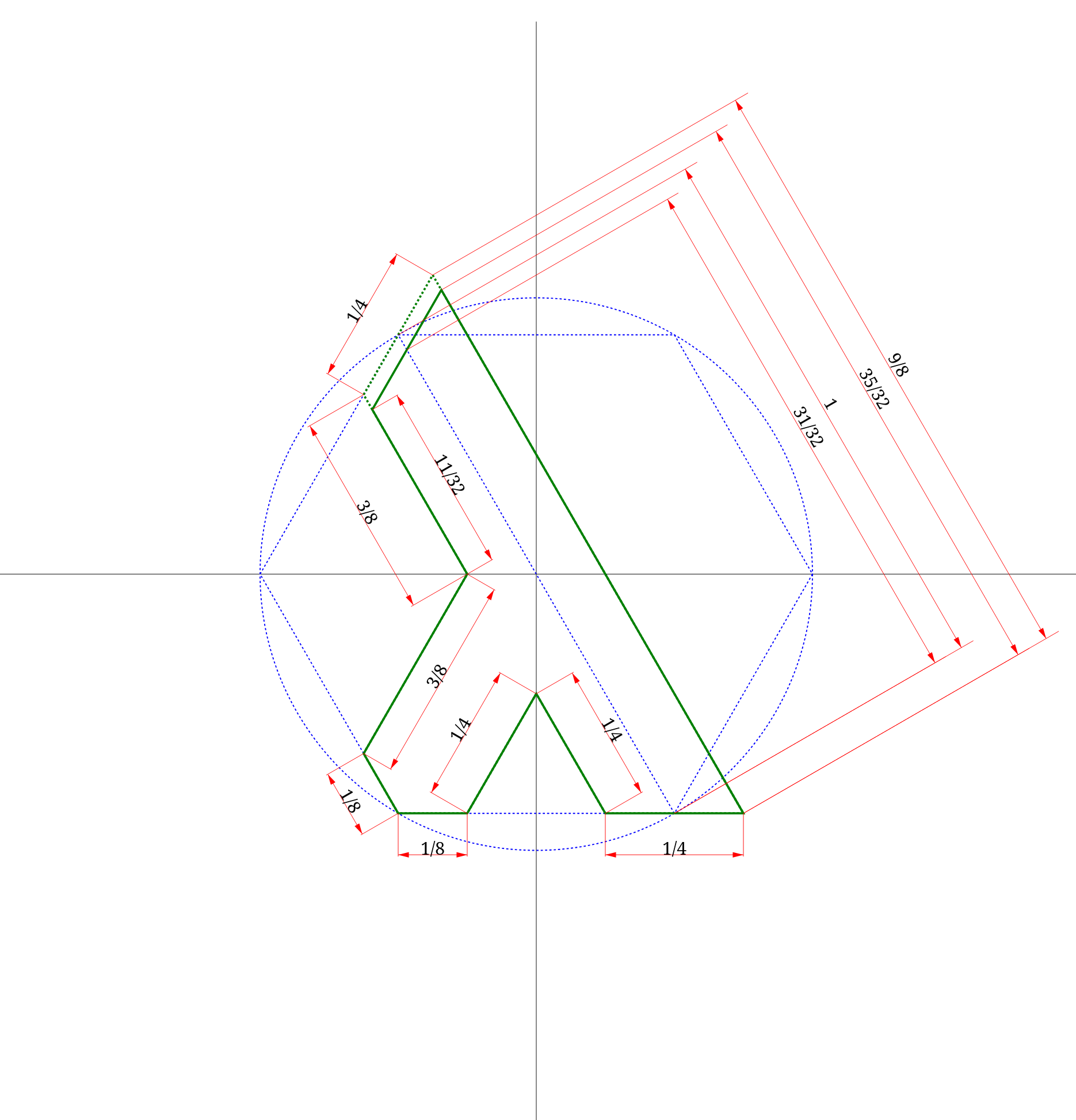
- The anatomy of the logo is not defined. This includes things like the size of the lambda, how long legs are, the size of the gap between lambdas, etc.
- The spacing between the logo and the logotype is undefined.
- The spacing between characters in the logotype is undefined.
- There is no general guidance on usage which hurts our ability to enforce a trademark after the board applies for one
- There is no guidance about usage, clear space, variations, sizing, and many other things that should be considered and written down when creating a logo, style guide, and branding identity.

To address these issues, I have begun re-creating the logo from code. The entire lambda is now parametrically defined. It is as mathematically perfect as computers can make it. And it creates deterministic SVG files. I want to accomplish all this while still preserving the original logo design as much as possible and brand recognition it has.
Changes
Unless you have stared at the NixOS logo for hundreds of hours, you probably will not see a difference. I have been staring at the logo for months doing this redesign and, at a glance, I cannot tell the difference. The biggest change is the proportions of the lambda. You can look at it two ways but they are effectively the same: the top part of the lambda got longer or the two bottom legs got closer together. This matches the same mathematical model that I created for the openscad implementation a year ago (and what tipped me off that something about the design was off). Spatially aligning the gradient definitions caused a minor shift in color across the lambas on the order of a couple bits. I am flipping between the new and old logo in my browser and I cannot perceive any color difference. Suffice to say the original look and feel of logo is well preserved.
Current work
If you are curious about the kinds of products that need need to go into a branding style guide, below is a picture of a snowflake’s lambda. This is one of the many images that would go into the anatomy section of the guide. Fully dimensioned. No ambiguity. I think it’s pretty cool.