I did some data visualization on the election results:
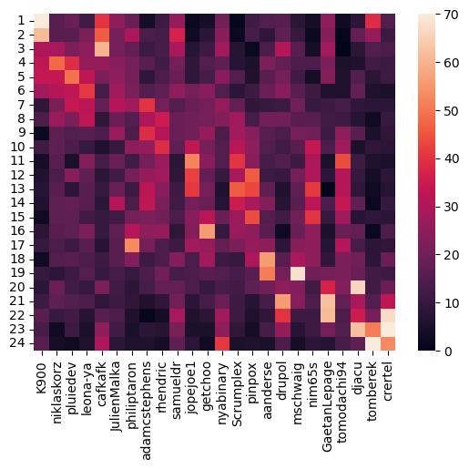
These are the number of votes for each position on the ballot for each candidate:
The candidates are sorted by average position.
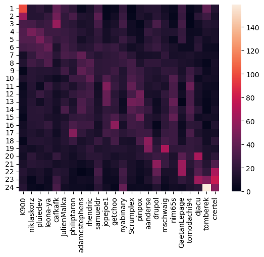
Since tomberek has 159 votes for position 24, this value overshadows most of the other values, so this image uses vmax=70 to make all other values more visible.
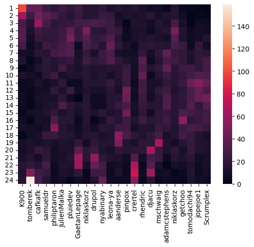
We can also sort the data by the opavote threshold reaching/elimination order (manually entered):
with
vmax=70: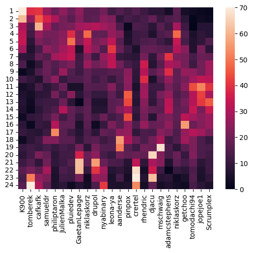
Here is the code:
import seaborn as sns
import numpy as np
import pandas as pd
import matplotlib.pyplot as plt

ballots = np.loadtxt("./ballots1.txt", dtype=int, delimiter=" ", skiprows=1, max_rows=443, usecols=range(1,25))

data = np.zeros((24, 24), dtype=int)

for ballot in ballots:
    for i in range(len(ballot)):
        data[i][ballot[i]-1] += 1

positions = [1,2,3,4,5,6,7,8,9,10,11,12,13,14,15,16,17,18,19,20,21,22,23,24]
candidates = np.array(["GaetanLepage","JulienMalka","K900","Scrumplex","aanderse",
              "adamcstephens","cafkafk","crertel","djacu","drupol","getchoo",
              "jopejoe1","leona-ya","mschwaig","niklaskorz","nim65s",
              "nyabinary","philiptaron","pinpox","pluiedev","rhendric",
              "samueldr","tomberek","tomodachi94"])

avg = np.zeros(24)
for i in range(24):
    avg += (i+1) * data[i]
avg /= 443

#sortkey = [2, 22, 6, 21, 17, 1, 19, 0, 14, 9, 16, 12, 4 ,18, 7, 20, 8, 13, 5, 14, 10, 23, 11, 3]
sortkey = np.argsort(avg)

for i in range(24):
    data[i] = data[i][sortkey]
candidates = candidates[sortkey]

df = pd.DataFrame(data, columns=candidates, index=positions)

sns.heatmap(df)
#sns.heatmap(df, vmax=70)
You can comment/uncomment some lines to get the variations i show here.
I hereby release that code into the public domain.
If these visualizations make you think the ballots were counted wrong, please read OpaVotes explaination of Meek STV.