I have made some work on the NixOS logo, which I am presenting here. Only recently have I noticed that my work took pace in parallel to the work done by @djacu.
Relevant links:
I wish I could have been part of previous meetings and we could have worked together from the start. Thank you to everyone involved with the current excellent work on improving NixOS branding!
TL;DR
- There have been two versions of the logo in use, one of them in most official logos, the other less commonly.
- The new logo specification and tool by @djacu is now using the less common logo, which is slowly becoming the new “commonly used” logo, instead of phasing out the less commonly used logo.
- I would like to entertain switching to a redesign more faithful to the (so far) more commonly used “old” official version of the logo.
An examination of the NixOS logo
We will now look at the logo(s) used in the past.
The old logo
In the old repository of the logo, there are actually two different versions of the logo.
- The
.svgfile(s), an adaptation by Simon Frankau of the original design by Tim Cuthbertson.- This has more or less been “the” official logo. It seems to be the most used and perhaps more “classic”, it is for example (afaik) being used as the logo in the wiki and in the discourse forum.
- This file has a bunch of issues with misalignements, non-horizontal lines, and more small inconsistencies.
- The
.scadfile(s) which were added later to the repository- This is being used less, but is now more common, because djacu’s new spec is based on this
- This is not simply an scad version of the logo in the svg files, this is a different logo with different proportions. Differences have been pointed out here
- This version does not have faults in terms of misalignments and small inconsistencies
The problem
The svg logo has been more common (in my view by far) and morenornless “the” official logo. Sometimes, the scad version has been used elsewhere and only a few people notice an inconsistency when the latter different logo is being used. It would be nice to use one version of the logo. I would have personally proposed properly specifying the more commonly used logo, and phasing out the less commonly used logo.
The less commonly used (but with less/no errors and better reproducible) is the one that @djacu has now properly made a specification for and written a python tool for it. Again: this is not a specification of the currently mostly used logo, but a specification for a slightly different logo. This means that we are now quietly switching to a different version. I am not necessarily against this, however: I would like to discuss how a new version perhaps more faithful to the previously commonly used logo could look like.
Building the logo
This section shows how the logo can be interpreted in terms of how it can be designed from the bottom up.
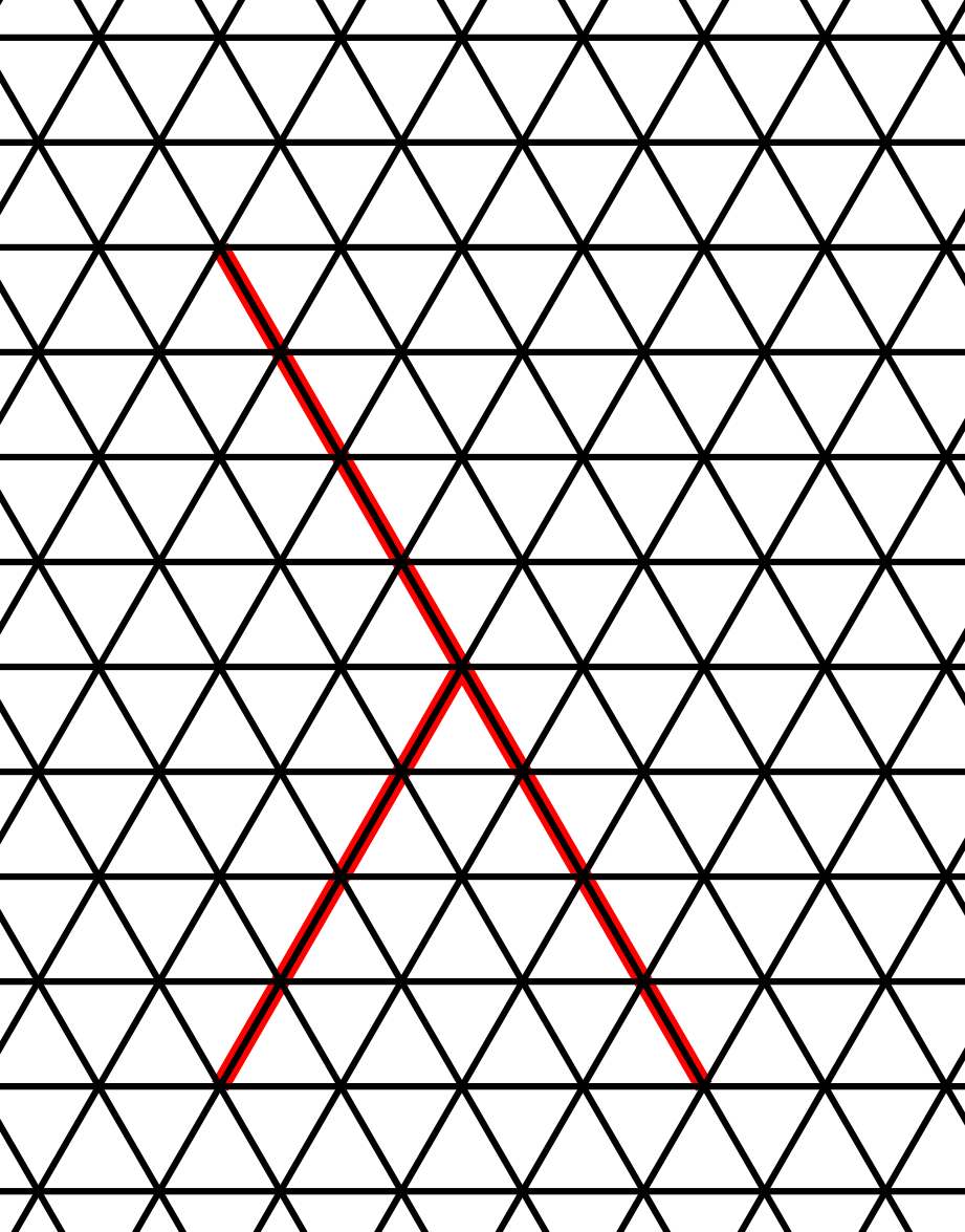
Anatomy of a lambda
First, we can start with drawing a skeleton of a lambda. We do this with two line segments, one line half of the size of the other, with the shorter one meeting the longer one at a 60 degree angle (leaving out details about orientation), to form a lambda:
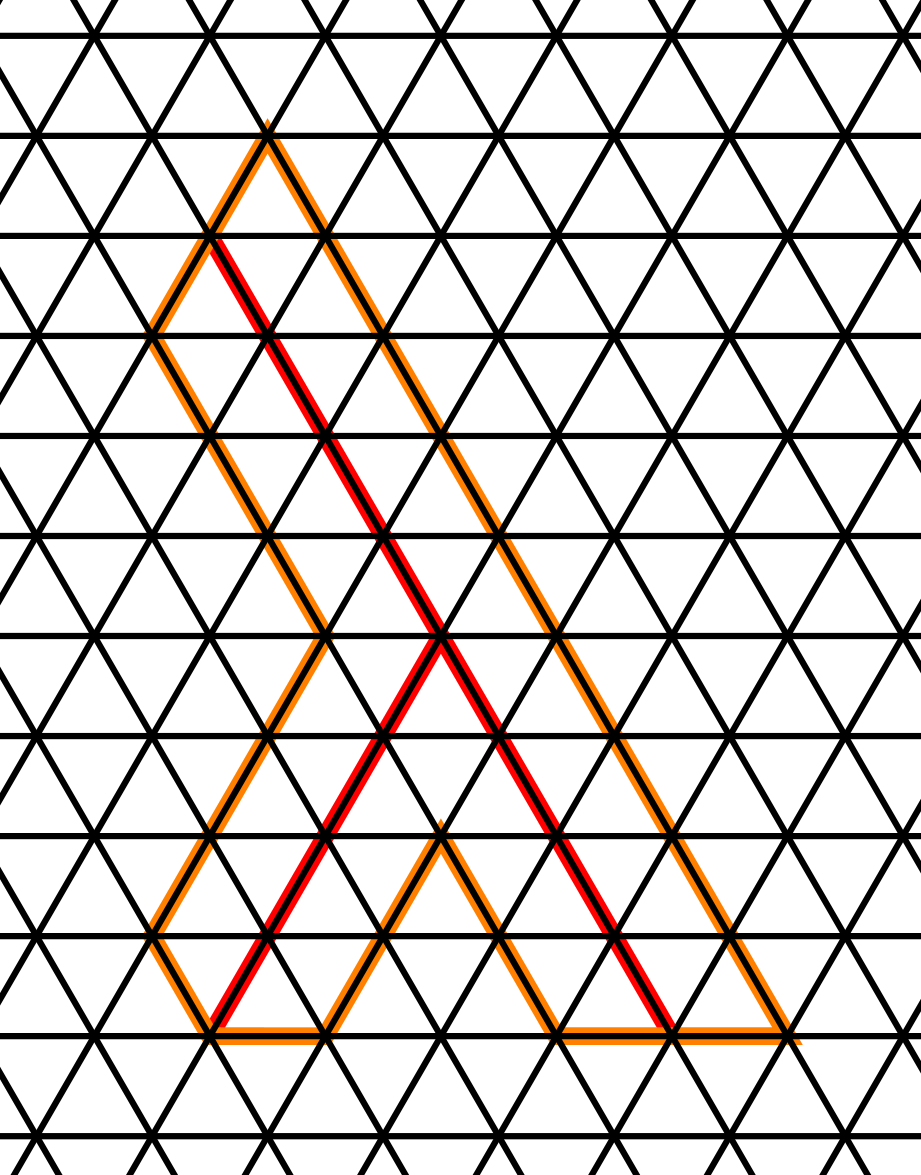
Then, we can “thicken” it by 1/8th of the length of the longer line, in the thick grid this is one unit. What happens at each of the endpoints of the lines is a bit different, I am going to skip the details here, but essentially this is just to make the logo look good in the end, and this is after all just exactly what the NixOS logo does.
Arranging the lambdas v1
Now, if we arrange six lambdas by making the “head” of one lambda touch the “joint” (or “buttocks”) of another lambda rotated 60 degrees clockwise, then we get this:
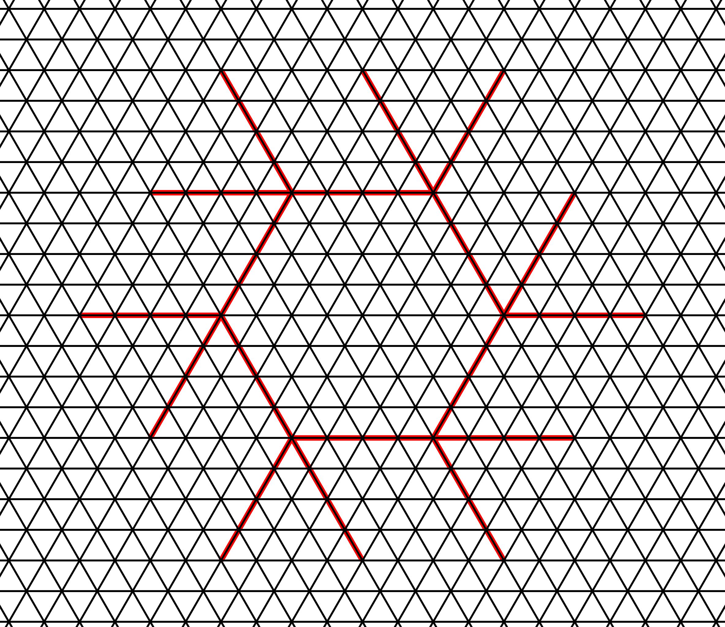
This particular arrangement also lines up with the origins of the NixOS logo, namely the design by Simon Frankau from the 2009 Haskell logo competition.
Now, if we fatten the lambdas again (also removing the skeleton for better visibility), we get this:
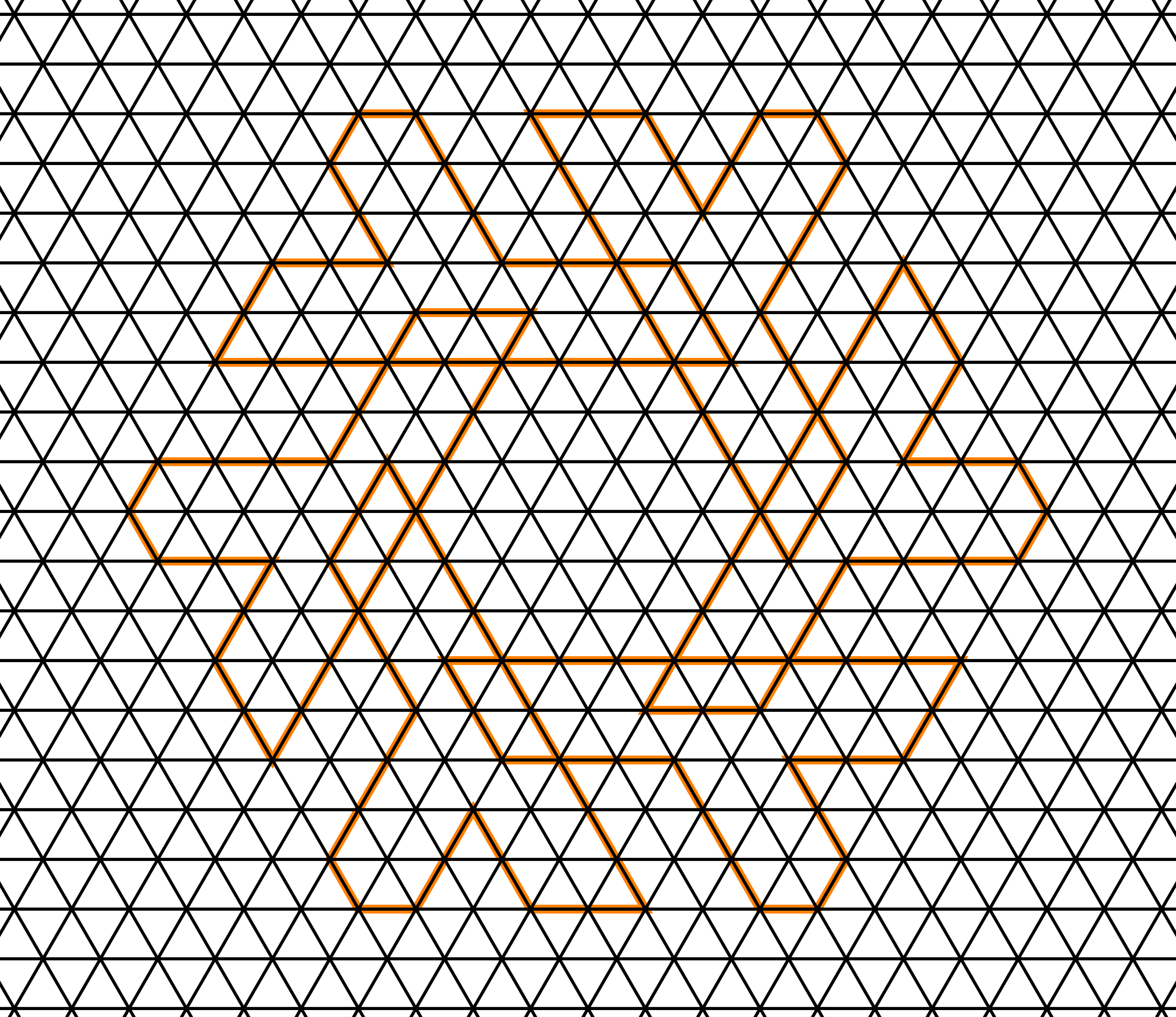
As we can see, they now overlap. If we fill out everything, this is no problem, but with alternating colors, what do we do?
We can “tuck” the “head” of one lambda under the “joint” part of the body of the other lambda (or going with a different word i chose earlier, stick the head of one lambda up the, well, you know…). This of course is not possible by naively using layers for each filled out lambda in an image manipulation program, since there is no lambda that is on top, one part of each lambda is tucked under another part of another lambda. It works with paper in the real world very well, and I can imagine very cool animations. Anyway, with this tucking, and removing the guides, we get this:

Note that this has no gaps (yet), I will talk about this later.
Arranging the lambdas v2
Now, in the step where we arrange the lambdas, to not have an overlap, we can add space in between the lambda skeletons, in precisely such a manner, such that the edges of the “fattened” lambdas (the orange outline) touch each other:
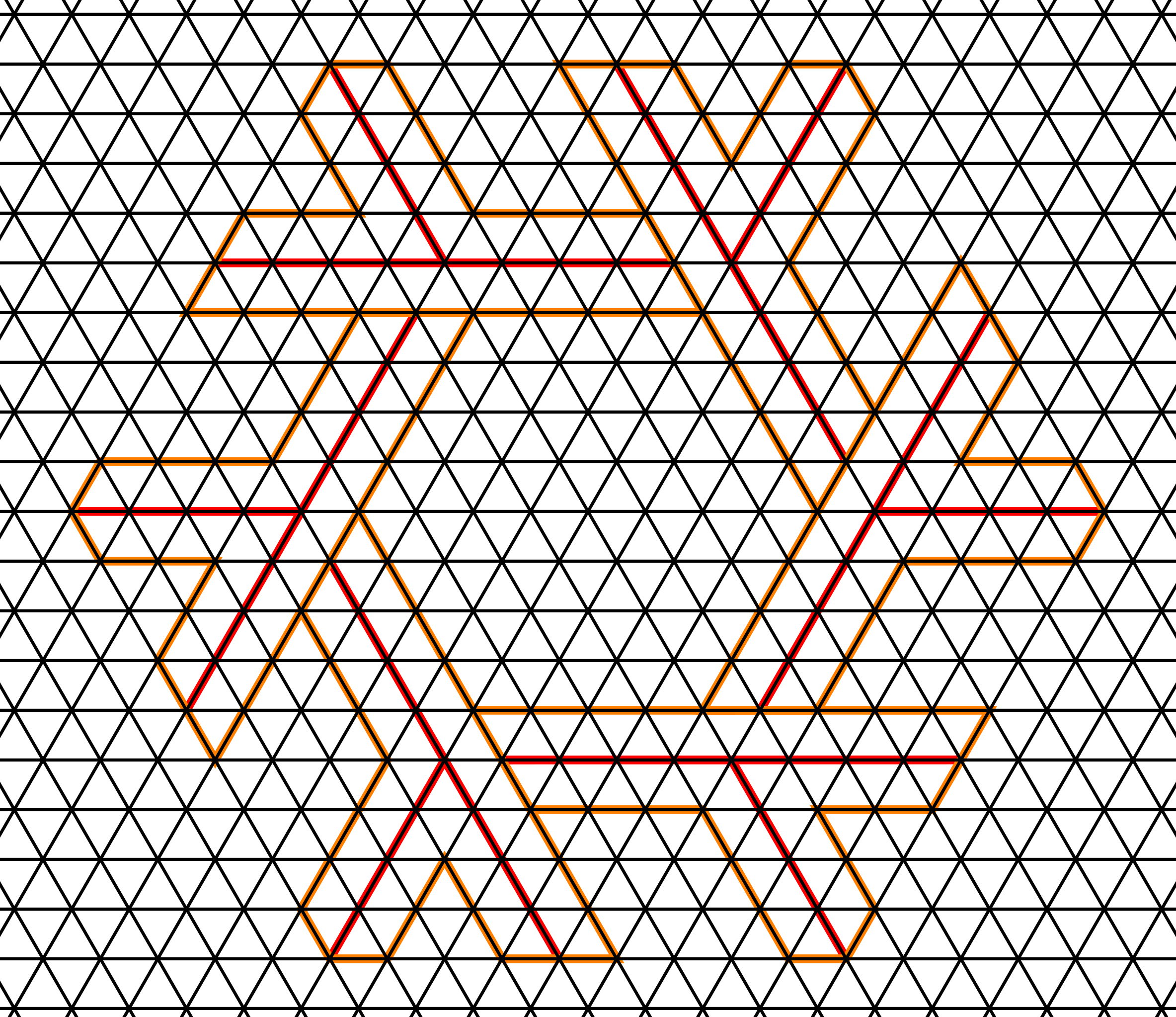
Filling out, and removing the guides, we get this:

This is, to the best of my knowledge and reading of the spec, the exact same logo as the .scad version in the old logo repository, and the same as @djacu’s logo, if we discard the gaps.
This version looks “thinner”, since by construction, we have more space towards the outside of the logo, a bigger hexagon, and longer necks.
The old logo
One interpretation of how the gaps in the logo come to be is that we stroke the outline (edges) of each lambda (before we do the “tucking under” that I described before). Starting off with the v1 design from above, if we choose the stroke thickness as 0.2 (or 0.1 on each side, or “radius” so to speak) of one grid unit as above, we get the following:

Making this stroked line then invisible (which is essentially the case if we have it on a white background, choose light mode on discourse), we have what I believe to be a “geometrically pure” version of the most commonly used NixOS logo, or at least this is the best I was able to come up with.
Note here that naively stroking, as we did here, also removes some of the filled out part of the lambda. This makes the lambdas a bit thinner, and therefore also screws up so many of the proportions that we started off with, since we have essentially added an inside margin of 0.1 units to the visible lambdas (after “tucking in”). This is, in my opinion, why the old logo was so hard to measure out, since we never see these lines, we only saw the filled out inside with proportions all very slightly off what we would like them to be. I also tried out stroking the outline of each lambda as can be seen after tucking in, which would increase the visible gap between the lambdas if we retroactively make the lines “invisible” again.
The only “nice” proportions here are only visible if the stroked lines are visible (dark mode discourse), in which case the empty spaces towards the outside of the logo are the same size as the lambdas. This is not the case if the lambdas are invisible.
Adding nicer gaps
To make a nicer logo, we must, in my opinion, add borders in a “nicer” way.
My personal proposal for a logo.
We shall again for now work with the v1 design from above.
In the above, we have stroked the edges of the lambdas, or essentially added an inner margin. What we should do instead, is just add an outline to each lambda, a border. That way, the nice shape of the lambdas and their nice proportions get preserved. Keeping with the “tucking under” interpretation from before, adding a border of 0.2 units before “tucking in” (so that as above, we get a gap of 0.2 units), we get the following:

This (with invisible lines) is, in my opinion, a better version of the most commonly used official logo.
Again, view this in light mode on to have all of this invisible. I kept them visible (in dark mode) so that you can understand the concept. This is, in my opinion, a much nicer version of the old logo, since the nice proportions are preserved, especially when the lines are invisible. With invisible lines, this amounts to the same as just “cutting off” 0.2 units off of the head/neck.
Now, what I propose, is two things:
- Not work with decimal-base borders/gaps (I believe “0.1” was chosen somewhere as an arbitrary number, and this is also visible in the
.scadfile of the original repo), but rather working base 2. - Use thicker gaps. I believe that thick gaps just look better, especially with a small logo or icon, where the otherwise very thin gap can sometimes render weirdly. In my opinion, either use a thick gap, or no gap (which also looks very nice in my opinion).
For the first part, instead of 0.2, we could take 1/4th and be very close to the original (a tiny bit thicker, and I am making this border “invisible” now). It looks very similar to the above, hardly distinguishable, but at least it is easier to construct that way. My first proposal for a logo would be this.

But since I want thicker gaps anyway, together with my second point, I propose a gap of 1/2th of a unit. Therefore the following is my (second) proposal for a logo:

The thicker gaps might look a bit striking to people used to the old logo, but I think it can grow on you. The thickness of the gaps should actually be a seperate issue, this is not the main focus of this post, so for now, I will mainly propose my first version.
Gaps with the v2 design
With the v2 design, as noted before, the .scad file of the old repo chose a parameter of 0.1 somewhere, which is just a weird arbitrary choice. @djacu chose a gap of 1/4th of what I call a unit, which I of course welcome as a change to the .scad-version from the old repo.

Further discussion
I am now just writing out my further thoughts and further endeavors.
Comparison of the logos
I am going to compare my proposal with the one that @djacu has worked on and is slowly being used more and more. I am not aiming to replace their work or design. After all, except for the ever so slightly different gap, it is the same as the .scad in the old repository, most of the work was just writing out a sort of spec in the article, and of course the python toolkit.
My comparison is independent of the gap size. I am rather comparing my proposal (or the “v1” arrangement of the lambdas before) with the spec from @djacu (or the .scad version) in terms of proportions. So really I am comparing the “v1” and the “v2” arrangements from above,
v1 arrangement (my proposal)
- Is, in my opinion, more faithful to the (so far) most used version of the logo
- It is also, in my opinion, more faithful to the original NixOS logo design by Simon Frankau
- It is possible to overlay the very thin prototype “stick” design from the Haskell competition (what the logo is based on) to this version in a way that makes sense, which is not possible with the v2 arrangement.
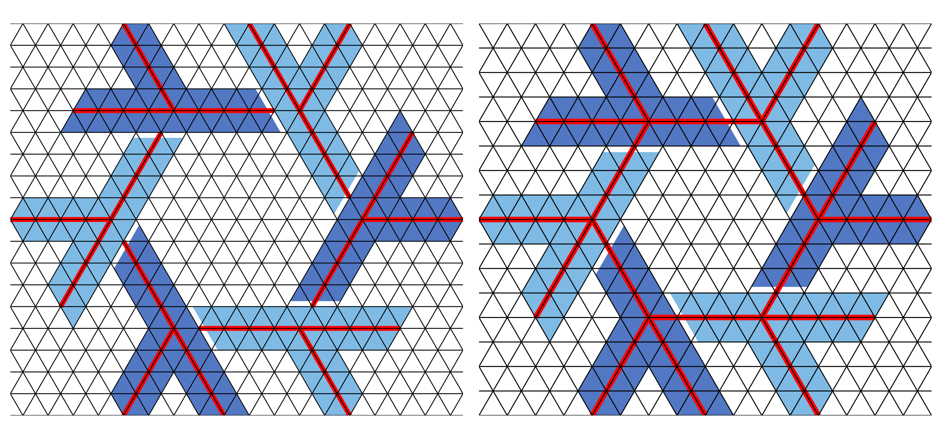
- The parallelogram-shaped spaces towards the outside of the logo have the exact same thickness as the lambdas
- The aforementioned parallelogram spaces have a side ratio of 2:3 (3 units “long” and 2 units “wide”), the two sides of the parallelogram that are part of one lambda are not the same length.
- The hexagon-shaped space in the middle is rather small
- The lambdas look closer to the more commonly used glyph for a lambda.
- The lambdas do not retsin their “original” shape, the long line has a 7:4 ratio to the short side (with gaps, especially thick ones the proportions are different anyway)
- This one is hard to explain: For the long line of a lambda, the outer edge (facing inwards of the logo) has two sub-segments that don’t touch the other lambda, they touch “air”. those two sub-segments have same length (3 units). The same goes for the inner edge, which is “interrupted” by the leg of the lambda, the two sub-segments touching “air” have the same length (2 units). This is true with with gaps.
v2 arrangement (old .scad from repo, @djacu’s version)
- Is already slowly being adopted more, and its rendering is already implemented in a nice python tool.
- The parallelogram-shaped spaces towards the outside of the logo have a thickness that is 3/2 as big as the thickness of the lambdas (3 units vs 2 units)
- The aforementioned parallelogram spaces have a side ratio of 1:1 (3 units “long” and 3 units “wide”), and the two sides that are part of one lambda therefore also have the same length.
- The hexagon-shaped space in the middle is rather big
- The lambdas look more close to a hand written lambda (also not uncommon as a glyph)
- The lambdas retain their “original” proportions, the long line still has a 2:1 ratio to the short side
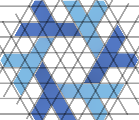
All versions side by side
From left to right: djacu’s version, original, my proposal.

It really does seem like the original version is “in between” djacu’s version and my new proposal. Both djacu’s version and my proposal have better proportions, it is up to interpretation as to which one captures the “original design intention”:
- My version keeps the original “thickness zero” skeleton intact, so the joints are still in the “correct position”, but the lambdas get shorter because they are being “cut off”.
- Thickening or thinnging the lambdas does not change their arrangement, but more or less of the neck is being cut off.
- @djacu’s version keeps the original shape of the lambdas, but they are now positioned differently, because the thickness of the lambdas changes the point where two lambdas “touch”, so they get moved further apart.
- Thickening or thinning the lambdas changes how they are arranged, they must be moved around to retain their shape
- The original version kind of has whack proportions.
- My personal view is, to repeat what I tried to explain in detail above, that this happened due to adding a stroked line leading to an inside margin, which I removed, so that the proportions are simpler numbers, which is how I came to my design proposal
Here are djacu’s version and my proposal with grid lines and a “skeleton” overlayed to illustrate what I described above:
What I want to do in the future
- I would love to have my proposal (the proportions, etc.) incorporated into the python tool that was developed by @djacu
- I am not sure if they are open to this, or how the community might react.
- After all, having two versions of a logo that look very similar is kind of annoying, and now I am stirring things up again. It sucks to do a bunch of eork just to have someone say, only after all that work, “but it should be different”.
- I want to repeat that I am very happy and thankful for all of the work @djacu and others have put into the logo.
- I haven’t tried out the toolkit, but if I understand it correctly, it should be possible by changing the thickness and gap and length parameters.
- I would like to write something that builds the SVG without external libraries, but strictly within nix, building the parametrized SVG via string templating for XML. Floating point arithmetic might be an issue, I have thought of many solutions. But one thing I have already worked out with a lot of people: Doing rotations is probably bad due to fault propagation. Even when using rotations as a feature of SVG, rendering those can have side effects. This is true especially because you cannot rotate vectors themselves when drawing an initial shape by 60 degrees, as far as I know, and therefore one must work with decimal coordinates, so there are already initial errors there. Instead, I would work with a pre-computed grid in decimal coordinates and work from there.
The SVG with a bunch of layers that can be turned off and on can be found here:
I do not want to invalidate anyone’s work. I would like to work together with the community.
Please tell me what you think!