tl;dr
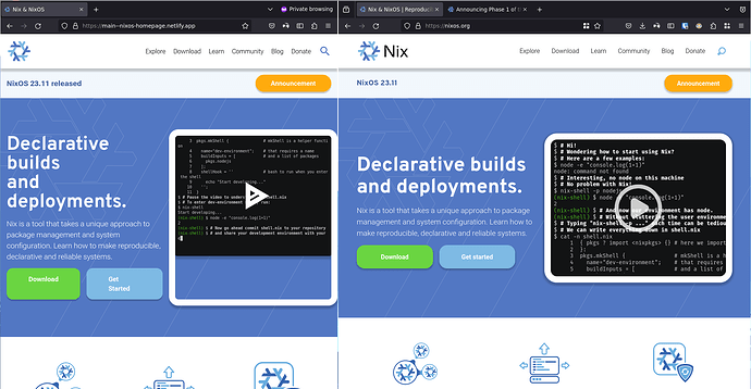
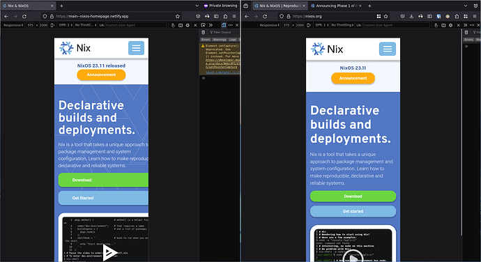
We modernized the tech stack of nixos.org without changing any content or functionality. And we would like you to report any regressions / UI glitches and differences in content between the current nixos.org and the beta (see below).
Website Beta: https://main--nixos-homepage.netlify.app/
Report Bugs: Sign in to GitHub · GitHub
The goal for the next week is to capture and fix all major glitches so that we can make the switch.
nl;iwtr
Dear Community,
during the last few year we got quite used to nixos.org with its design, structure and content. Unfortunately, we also got used to its quirks. Over the years the technical stack, which grew historically, got harder and harder to maintain. And this does not even cover the marketing team, but also other members of the community, who want to contribute changes and get a local working copy of the website running. With more and more complaints the marketing team decided it is time to do something about it.
But it is not quite what you think. This is not just a reskin of the existing website. This project aims to modernize the website and its components, fix UI/UX problems and other bugs and lastly give the site some fresh coat of paint. These changes will be split into different phases.
Phase 1 (current phase)
This announcement covers the beta testing of what we like to call Phase 1. The goal of which is to rebase the website “as is” (which means, everything looks the same and stays in its place) to a new tech stack. For this new tech stack we chose Astro and therefore NodeJS as a base. We made the choice to use Astro due to its integration with lots of tools common in the NodeJS development landscape and its useful helpers and integrations which help to keep the codebase minimal and automate many things in the development workflow, thus keeping the bar for entry low.
Another thing we wanted to make sure is to have a consistent and easy way of styling things. While CSS and its classes are somehow useful they also are quite limiting for those unfamiliar with its concepts and the design system the website uses but want to contribute new ideas to the website. So we choose Tailwind as a solution. While it makes working with CSS concepts a lot easier it also allows us to introduce “constraints” which keep developers from getting off track with their suggestions and preventing divergences from the design overall.
We also use a component system and MDX to help people write consistent looking pages and posts while (re)using parts that will automatically look good in the final result when used.
Lastly we dusted off some of the content format and moved all “postings” over to the Markdown format. So no more fiddeling with DocBookXML. Just use your Markdown editor of choice (or your standard text editor) and start contributing.
Phase 2 (next step)
As you probably figured out by now, this is only the first stop in a longer journey to making the nixos.org website more hackable, accessible and awesome overall. So Phase 2 will cover UI/UX problems (which will greatly cover accessibility issues) and other bugs in general. We want our community to grow and enjoy Nix and thus we should make and keep the website accessible to all people. This also may include features like a dark mode for example (which btw. also aids accessibility, since people with brightness sensitivity also prefer dark mode to reduce eyestrain).
Phase 3
In Phase 3 we finally get to the point which will create the most immediately noticeable changes. We will modernize the look and feel of the website. With a solid tech stack and a usable structure and good practices in our backs we are going to update the design of our website and make it more fresh looking and appealing to new audiences.
We know this is quite a long journey and that many people would prefer to see a visual update first but from our point of view it is important to first put the site on a solid foundation (hackability and usability wise) and then work with this foundation on visual things.
Thank you
At this point it is more than necessary to say thank you to everyone who contributed or advised regarding this work already. And thanks to the marketing team, which kind of got me into this whole thing of working with the Nix community instead of just using it. Seeing people having motivation to make a change is really rewarding.
If you want to join the work on the NixOS websit, feel free to join the marketing Matrix channel or just work on open issues.
Let’s make the future of Nix awesome one CSS line at the time ![]()
Keep being awesome,
Thilo from the Marketing team

