New Color Palette for the NixOS Homepage

Hello everyone,

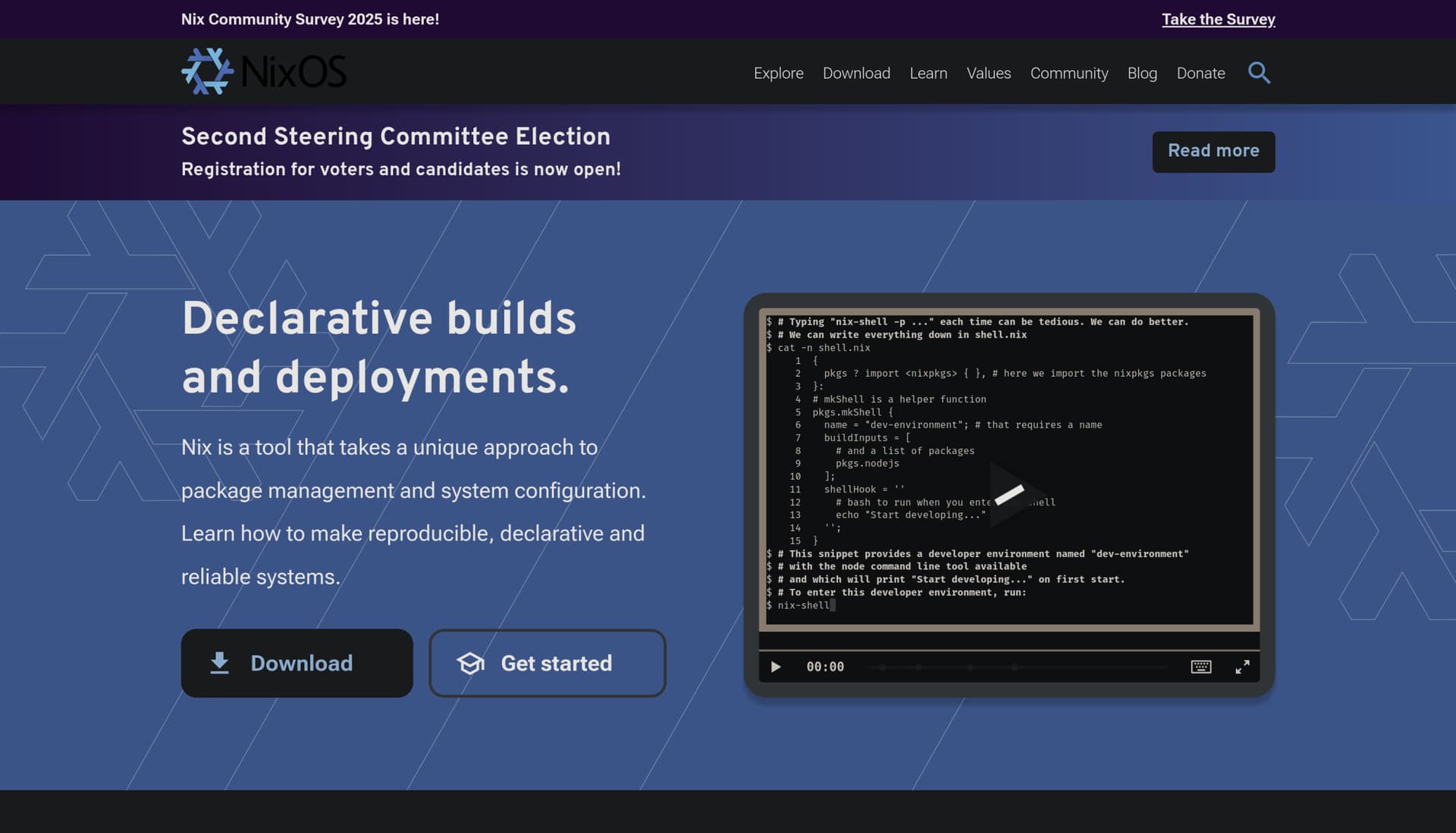
You may have noticed that the NixOS homepage looks a little fresher lately. That’s because we’ve introduced a new color palette.

This update is part of the ongoing branding work by the NixOS Marketing Team to make our visual identity more consistent, accessible, and adaptable across different media. The refreshed palette builds on the classic Nix blues and introduces a more cohesive set of supporting colors for improved contrast and visual harmony.

A huge thank you to @avocadoom, our Webmaster, for their work in migrating the homepage to use the new color palette. This was a large effort that touches almost every part of the site, and the results look fantastic.

39 Likes

Thanks for the nice and timely update!

1 Like

The colour contrast between page elements looks crystal-clear now, cheers!

1 Like

Thanks for the work !

In the values section which is white on blue, I can’t see what I’m highlighting to copy paste things. Is this normal ?

2 Likes

Hmmm normal but not intended :sweat_smile:
Probably just needs an update to the ::selection pseudo element.
Thanks for the report!

CC @avocadoom for visibility

1 Like


Looks great, it might need a little bit of fixing up with the logo when using DarkReader. But overall, this looks great. Great work @avocadoom.

6 Likes

Yeah, this decoration around nixos search is also incorrect, but it’s not a regression

1 Like