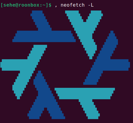
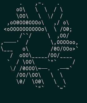
I couldn’t find any handrawn NixOS Ascii art, so I drew some myself.
Check it out in my repo and if you drew a better one please create a pull request or something ![]()
I couldn’t find any handrawn NixOS Ascii art, so I drew some myself.
Check it out in my repo and if you drew a better one please create a pull request or something ![]()
Mind explicitly adding a license? I guess since it’s art a creative commons license would be most appropriate.
When would this be needed/useful?
TBH the letters in the full version are illegible to me (I would never be able to read the name, not even part of it).
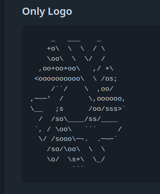
For me the only “usable” version would be “Unfilled Logo” from legacy. It’s surprisingly detailed, clear and crisp, actually.
Plenty of distros like putting an ascii art logo in the text boot logs, IRC motds or neofetch and such. It’s just a neat little attention to detail thing in some situations.
Art doesn’t per-se need a clear purpose beyond making things more enjoyable to look at, but if you must, branding in non-graphical environments is still useful.
I guess IRC makes sense. Neofetch already has this:
Anyways, I’d vouch for the simpler art but keep the name just text so it is actually working as branding
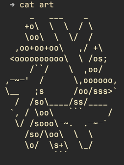
I would really like to use them in a motd but they are stretched which looks a bit odd …
What font do you use? Can you maybe send a screenshot?
In my browser with default settings on Firefox with Plasma:
and that’s in wezterm with Jetbrains Mono
Oh yeah it seems to look different because of my font, I will draw another one slightly wider version.
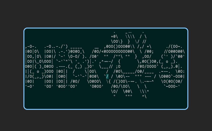
How does this look?
     _    ___    _
    +o\   \  \  / \
    \oo\   \  \/  /
  ,oo+oo+ooo\   ,/ +\
 <ooooooooooo\  \ /os;
     /``/     \  ,oo/
,─~─'  /       \,oooooo,
\__   ;s       /oo/sss>`
  /  /so\_____/ss/____
 `, / \oo\    ```     /
  \/ /sooo\─~~.  .─~─`
    /so/\oo\   \  \
    \o/  \s+\   \__\
          ```
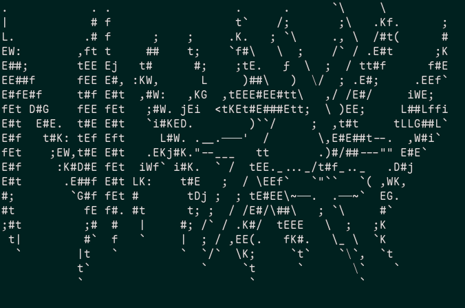
Sorry, I have no idea what I’m looking at. In fact it seemed so random/jumbled that I thought my browser was messing up the font rendering. But then I noticed that it was actually an image.
Let’s keep it at: not everyone’s visual processing works the same.
Sorry, I have no idea what I’m looking at. In fact it seemed so random/jumbled that I thought my browser was messing up the font rendering. But then I noticed that it was actually an image.
I assume it (their last posted artwork) is inspired by metal band logos which can often be hard to read and have letters squished together.
I’m actually quite impressed by how both stylistic and readable it is at a this scale. It would make a great touch to a lot of rices.
Thanks for making this @permafrozen!