So first: this was a nice post. I’d missed the Garnix announcement and didn’t realize that the free VMs were so generous. It’s also cool to see a concrete example of how easy it is to get a simple service set up with this new feature. Thanks for writing it and sharing it!
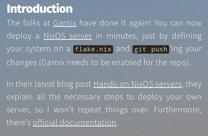
But is the following the intended color scheme?
This is hard-to-impossible to read for people with clinical light sensitivity or luminance contrast issues (I have both, unfortunately). It would be nice if I could read this without totally clobbering your formatting!
Thanks for your comment! Now this is a tricky one for me, I’ll try to improve accessibility, but can’t promise anything in the short-term. I’m really bad at CSS ![]() , but if anyone wants to help, the source code is here: GitHub - gvolpe/gvolpe.github.io: Personal website & blog
, but if anyone wants to help, the source code is here: GitHub - gvolpe/gvolpe.github.io: Personal website & blog
As a workaround, the only thing I can offer you is to go into the developer console on your browser, inspect the HTML and change the following:
<section id="projects" class="main style-post dark fullscreen">
For this:
<section id="" class="main style-post fullscreen">
Quotes will still be unreadable unless you select the text, but the rest should render fine, hope that helps!
Alright, just deployed a poor man’s accessibility option that sets the background to a solid dark color when you click on it, short-term solution but hope that helps!
Hey! Thank you so much. I’m delighted by your response and that you deployed a change so fast. ![]()
As far as workarounds, because of my vision problems, I do currently have a few go-to tools for this:
- the extension Dark Reader, which manipulates background and foreground colors
- the extension Midnight Lizard, which does exactly the same thing but is often a little slower and sometimes works when Dark Reader doesn’t
- Firefox’s built-in Reader Mode, which is great but only works for article-type content and sometimes can’t figure out complex layouts (so it doesn’t load at all)
- the extension Page Shadow, which has many features but I use exclusively for inverting the colors of light-mode screenshots and diagrams
- a pair of dark sunglasses at my computer desk, which doesn’t really do the job but is better than nothing in a pinch
In the case of your blog post, Dark Reader didn’t immediately do the trick, Midnight Lizard helped a lot, and Reader Mode made your blog even easier to read at the cost of totally ignoring your styling. I couldn’t have read the whole post without those tools, so I’m glad I had them.
But I included that feedback anyway because it’s more fun to browse a more creative, intentionally styled web than the one you get out of automatic restyling tools. When I can turn those tools off, I get to enjoy a prettier and more varied web-- and one that better connects me with the creative intent of the people who make the pages I browse. The content of your blog post clearly conveyed your present excitement about iterating on your blog’s design and tech stack, and its style also clearly had something to say. And I liked it: something simple, playful, ‘light’ (as opposed to heavy), and smooth but not in a self-serious way. So I hoped your present enthusiasm for tweaking this blog might extend to an interest in translating that aesthetic into a format with higher contrast and lower total light output, and offered my feedback even though I already had a way to get at the raw text.
And your response made me glad I did! Thanks again and congrats on this project and the fun you’re having with it.
